Data is at the heart of every manufacturing process, but managing and presenting it in a clear and accessible way can be challenging. In the FactryOS MES, users often need to view large amounts of data simultaneously, which can lead to cluttered screens, and difficulty in finding the right information. This blog post delves into our approach to data grouping, which allows users to filter and organise information, making it easier to focus on what truly matters.
Why is clear data representation so difficult sometimes?
Our clients have a lot of data. More specifically, they have a lot of data they need to see all together at a certain time or in a certain situation. However, showing everything on the screen all at once will mean a lot of scrolling and a lot of searching to find the thing you’re actually looking for.
For example, the left interface below shows a huge amount of data on one single object. And even though it’s zoomed out as much as possible you can only see about a third of the data… The interface on the right is how we improved it.
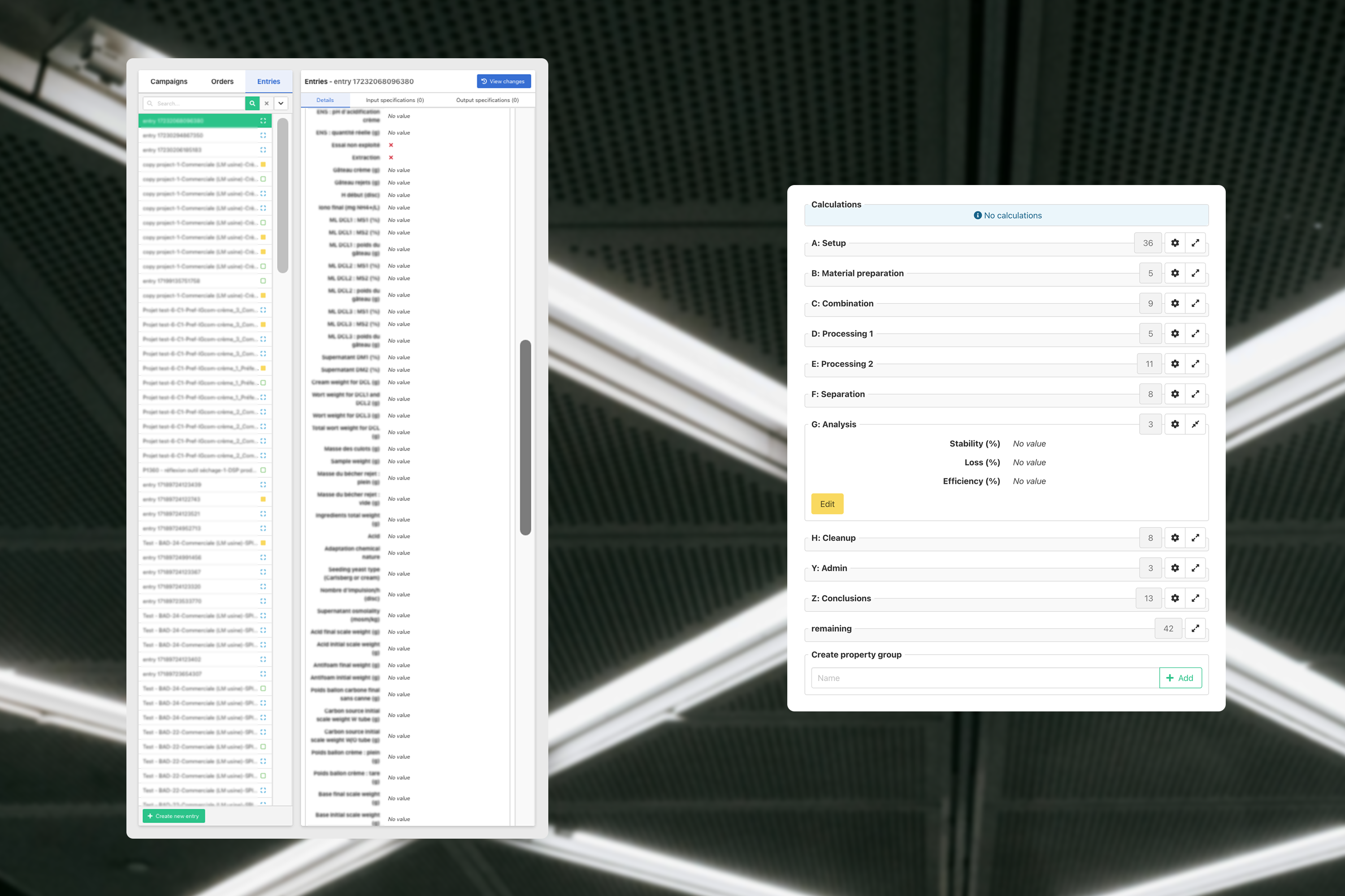
This brings us to the subject of this blogpost: How can we hide certain information so that the actual important information has enough space?
The very short answer to this is: filtering. The long answer can become complex quite fast partly because it can depend on the client a lot. Every company works in their own way and thus it’s important to show them what they specifically need.
A lot of data in our system is connected in some way or another, which is a big help in the filtering of data. More specifically these connections can help filter when asking the following simple questions:
- Where? Are you working in a specific place in the factory?
- What? Are you working on a specific item?
- When? Are you part of a certain shift?
These answers can be so important that the first question is already being asked to a user when they are logging in. A lot of this other filtering is done by navigating and selecting the thing you want to see more details of.
This type of filtering however is not the focus of this blogpost. Instead, we’d like to focus on the data you still need on your screen, but that doesn’t need to be visible all the time.
A very short introduction to MES
To understand this blog post, I need to briefly explain a small part of an MES system. Namely, the 3 types of objects present in it: campaigns, production orders, and entries (or production steps).
A campaign can contain a number of orders, an order can contain a number of entries. An entry is a bit strange in that it itself can be the parent of a number of other sub-production steps. Orders and entries both have types, which can be used as templates for their starting data, but are mostly used to specify how they should be worked on.
For example if we have a type “welding” then the user working on the welding machine should only be able to see entries with their type set to “welding”.
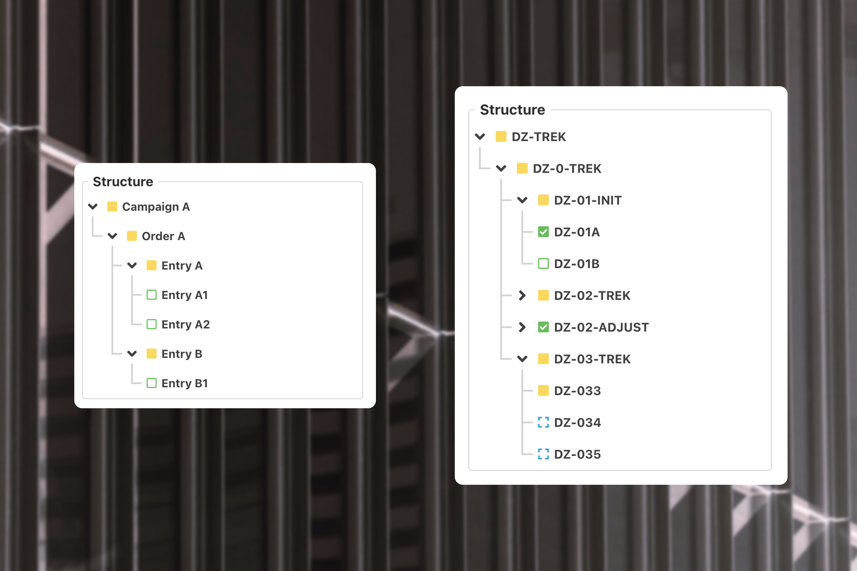
All these objects (campaigns, orders, and entries) have properties, simply a list of IDs and values. These are user-defined and thus the focus will be on these properties because a user can create as many as they want.
The way our client works with their data
So in this post we want to talk about a solution for a specific client, although we might start using this method in other places for other clients as well.
This client has many different steps in their production flow. The smallest steps still have all their properties together in one of our entries, but the steps exist for a variety of reasons:
- A step can be for users of a specific role.
- A step might need production to reach a certain phase.
- The entry has calculations that use the value of certain properties from different steps.
- Entries are frequently copied but should only copy parts of the properties so small variations can be made of the same base product.
This makes it so that we still want to store the properties together but visually not show everything all the time.
Splitting properties into user defined groups
The solution seems easy at first glance, just group the properties into blocks and collapse and expand those blocks when the user needs to see it.
There are however numerous important things to consider:
- Not all entries have the same properties, especially since the client can create new entry types or adjust existing ones.
- Not all pages in the system need to show the same grouping, only what is relevant for those pages.
- Some properties need to be in multiple groups. For example if the process engineer fills in property A in group “for engineers”, maybe an operator also needs to see property A in group “for operators” so they know how to fill in property B.
- We need a dynamic virtual group that contains all properties that aren’t in any different group yet.
- The selected properties should be sortable per group, so that the operator can still find the right property in a group of e.g. 10.
- We don’t want to get involved every time the client needs to change anything with the grouping. So the client needs to be able to adjust all these things. We also need to make privileges so that they can adjust who can create and/or edit groups.
Here’s an example of what the end result could look like:
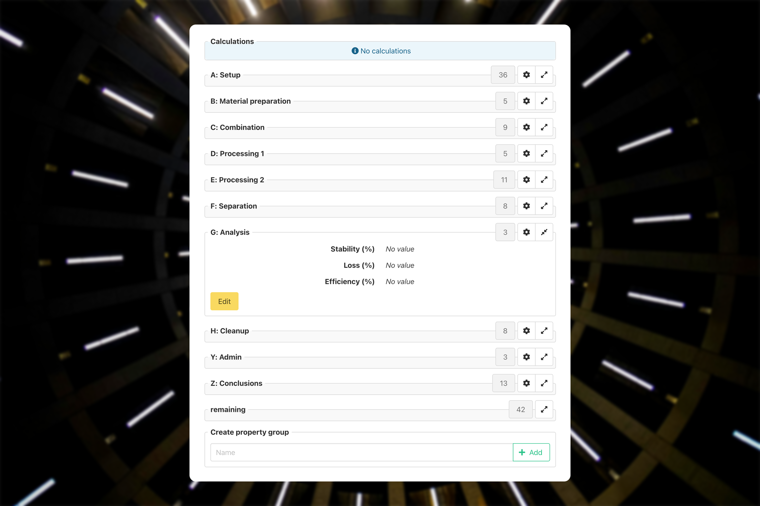
Let’s go over what we’re looking at in the screenshot above.
At the top we see calculations, in this case empty because as you can see in the middle, not all properties have been filled in yet.
Below that we have our groups, all with a title, the number of properties inside, a configuration button, and finally the expand/collapse button that we also have in other places. You can see that group G is expanded and it has its own edit button so you don’t need to scroll down to start changing those properties.
As the last group we have our dynamic “remaining” group. This will contain all properties that aren’t in any group. If you were to create a new entry type, everything would be in here.
Below that we have an input field to add new groups. To get started all you need is a name for the group and of course the privilege in our system to create a new group. After that it’s all about taking a bit of time to configure your new group like in the screenshot below.
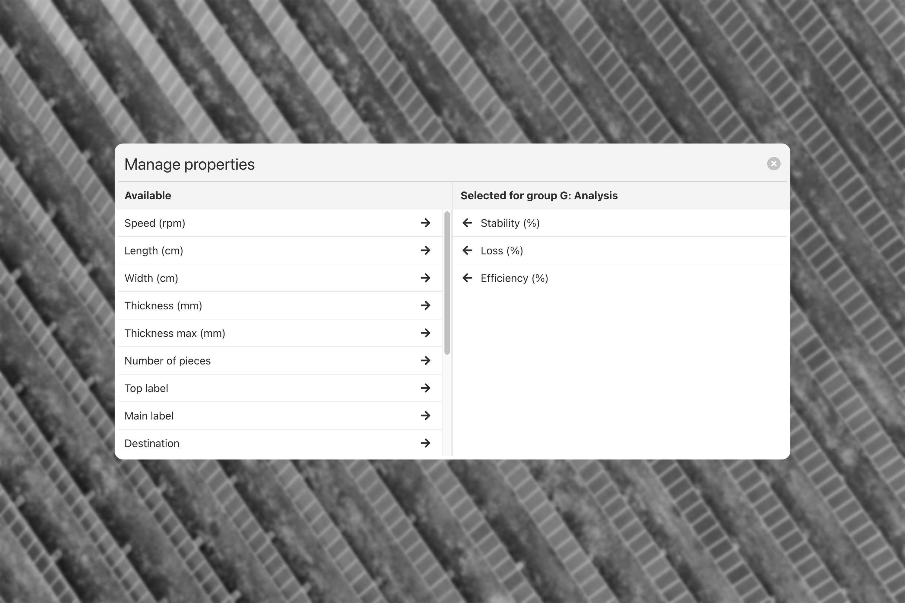
Here we see part of an example configuration.
For this entry the client has about 100 properties. However, for this step in the production they only want to show 3 of those, making it all very concise and readable.
For each group we show all available properties, so that a certain property can be visible in every group if they would want that. Visible fields can be sorted and of course the group can also be deleted. This way the user can test things out without affecting any of the data.
The technical side of grouping and the evolution of storing the configuration
Let’s take a look at the technical side of all of this.
When you make things configurable for the user, you need to store it, unlike putting that information in the code.
At the start the client just gave us a few group names and we didn’t give them the ability to create groups. It became clear fairly quickly that we required more flexibility.
From there we knew it needed to be different for each entry type, because they can have widely different properties. Most entries will have 99% the same properties as their type, so anything not in the group would just end up in the “remaining” group which is fine. So it made sense to store this on the entry type object.
Since we only need to store which properties need to be visible and the order they’re in, we just save an array of all the chosen properties for each group on each entry type.
Evolution of the grouping
Another tweak was the page this group is for. On one of those pages they wanted to gather all the entries with a certain code that the user searches for. Here they get unlimited entries with that code, and 1 group per entry. This group is automatically filtered on some properties if no configuration is found.
Using our grouping allows the user to always edit the group in case they add new properties that don’t strictly follow that initial filtering they said they wanted. This way the page can work with new properties that are added along the years.
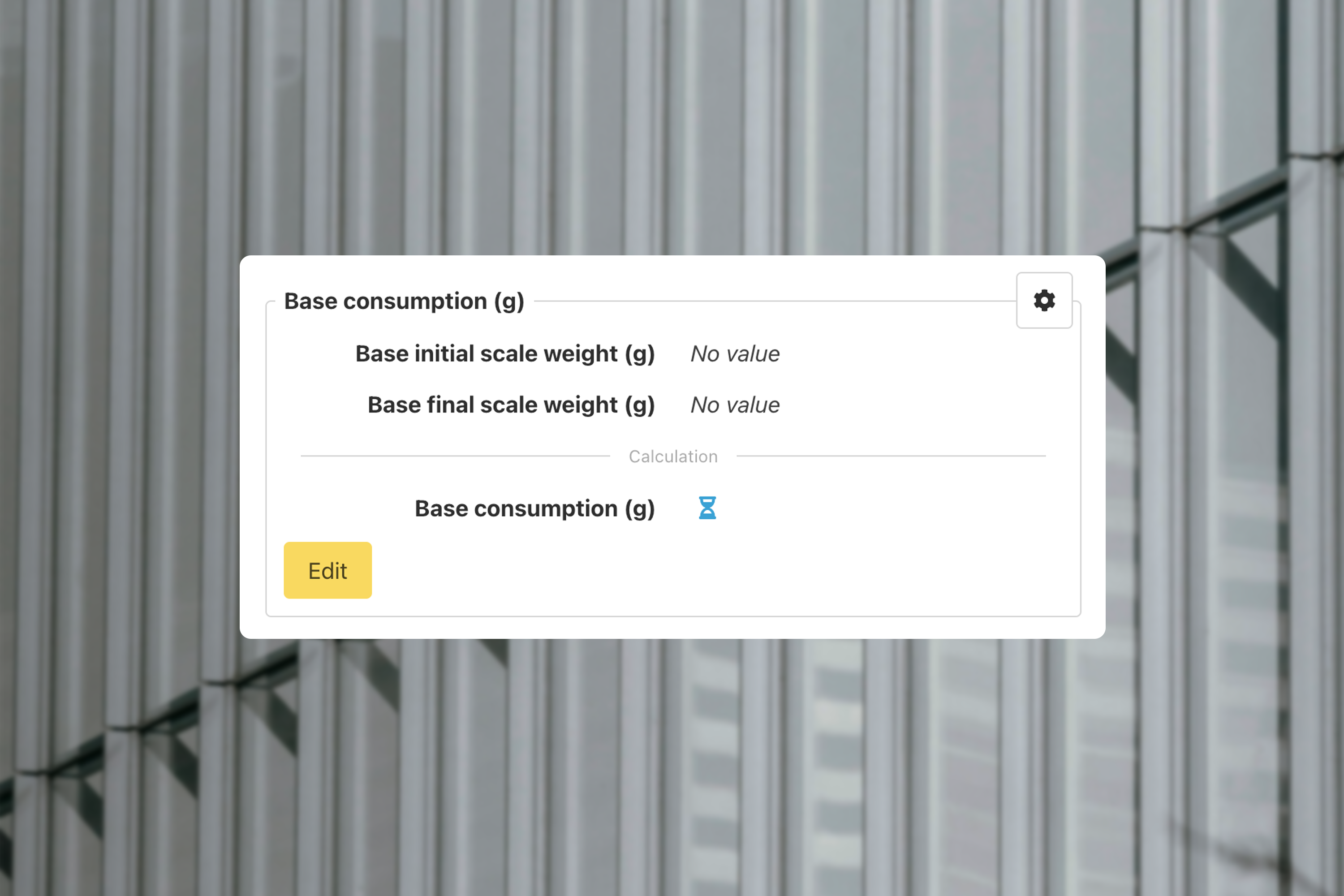
On another page we use these groups to show or hide formulas. These formulas are the base of our calculations that we referred to earlier. When the user shows a certain formula, we load all the properties for that formula. Once all the properties are filled in we calculate the result and store it.
Below you see an hourglass icon, which indicates the calculation is waiting for the properties above it to be filled in.
Copying of groups and entries
Our latest use of these groups is when copying an entry or a group of entries or even an order with groups of entries.
When a user makes a copy, they want some data to always be copied automatically but want control over the remaining data for each individual copy.
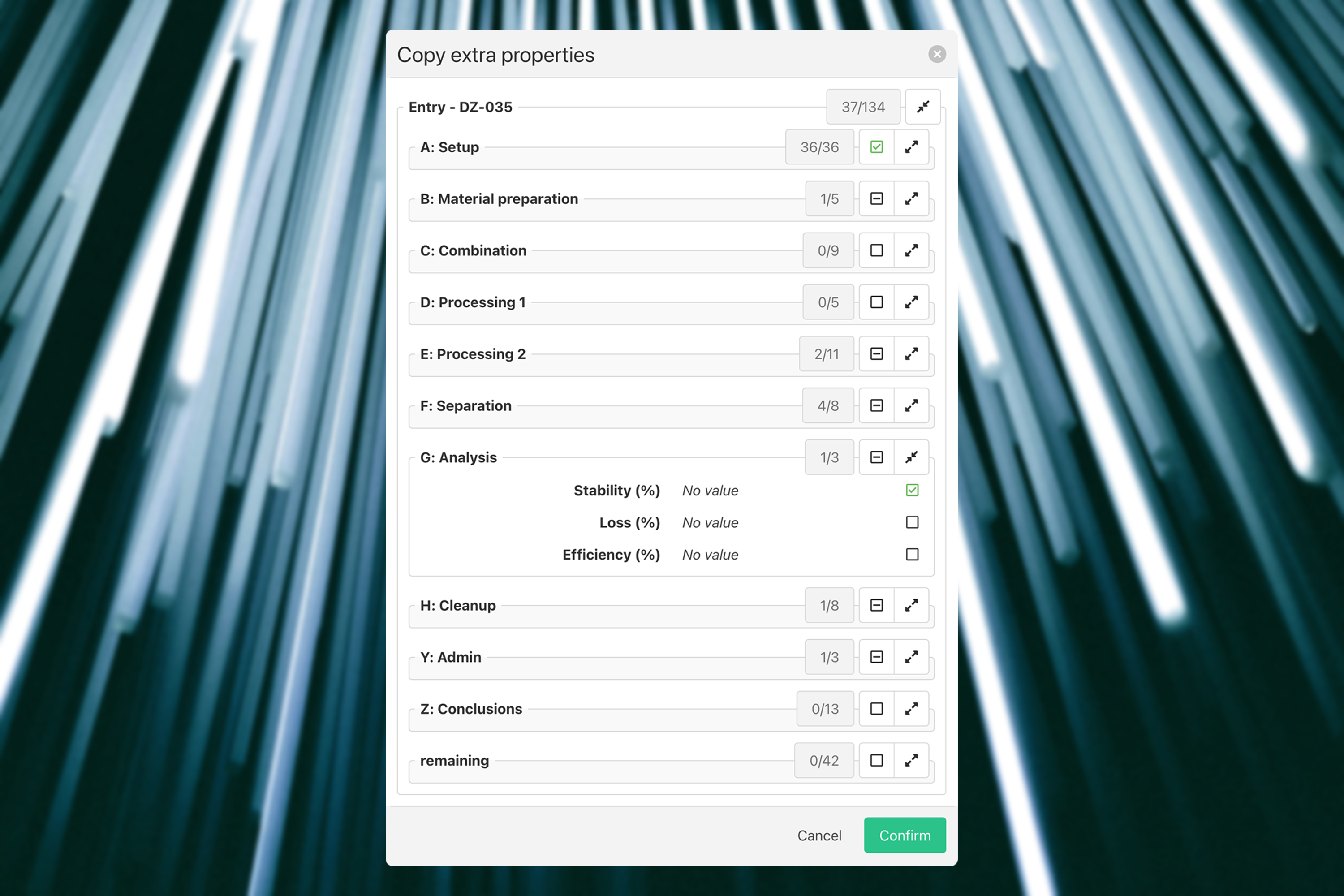
The copying happens on a page where we already have groups, so we can re-use the group configuration that we already have, but with a few tweaks: - The user can’t edit any data in these groups. This would just complicate the whole copying process. - The user can’t create or edit any group. Same reasoning as the previous point. - The user can select each individual field that needs to be copied. - The user should be able to choose to copy a whole group. - The first group should be selected for copy by default. - The user can see for each group how many items are selected without having to expand the group.
And this is the screen that we end up with. In this example we’re only copying 1 entry, but followup entries that are also copied will just show up below this in the same manner.
How we avoid bugs
When developing something over such a long timespan (over 18 months in this case) and with different variations of uses, you’re going to encounter some bugs at some point. Luckily every line of code that is written gets checked by a linter (a tool that shows errors for common code problems) and afterwards by a colleague as well.
After that, our client also tests the new functionality on their test system. At this point we should have eliminated all bugs, but you can never fully predict how clients will use your software. This step also gives the client the opportunity to give feedback.
Conclusion
Empowering users with control over their data visualisation is one of our core philosophies at Factry, as it significantly enhances the usability and efficiency of our MES system. However, to provide this flexibility requires a lot of upfront work from our developers. From storing configurations to ensuring that the interface remains simple and intuitive, every aspect must meet the unique needs of each client.
By involving clients in the testing and validation process, we can better refine these tools. In order to deliver a solution that balances flexibility with simplicity and adapts to evolving needs of the client. This ongoing collaboration ensures that our MES system remains a powerful tool for managing data, and stays tailored to the unique workflows of each client.
As always, we welcome your feedback and are committed to continuously improving our products to meet your needs. Feel free to reach out to us here.


